100 Romance Covers
“One [type] is not born but, rather, becomes a woman [gendered].”
—Simone de Beauvoir, The Second Sex (defaced by the author)
Recognizing the gendered in typography, if type is not born that way, requires seeking out gendered objects, situations, and messages and seeing how, within those, type is used to build associations and so create a gendered typography.
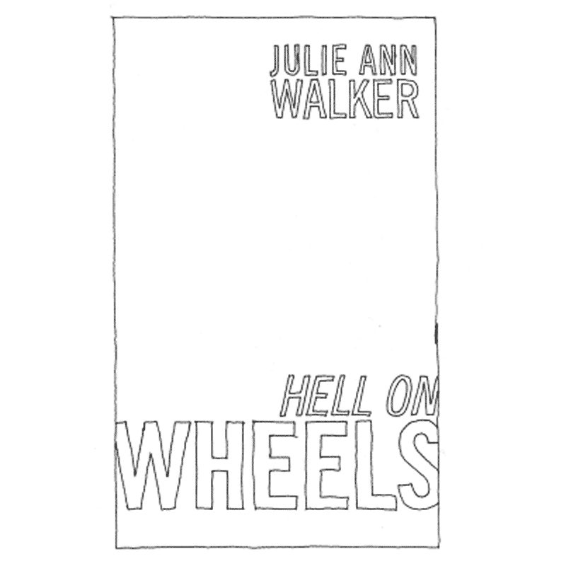
To this end, my investigation, entitled 100 Romance Covers, is just that: 100 romance covers, redrawn. Specifically the novels featured in NPR’s article “100 Swoon-Worthy Romances,” which ran on their website back in 2015. NPR arrived at this list first by crowd-sourcing the initial nominations (which resulted in over 18,000 of them) then presenting the culled and tallied entries to a panel of four Romance novelists to decide the final list of 100. And I redrew all of them, emptying out their imagery and their color and leaving behind only the outlined type.
Now the obvious question: why romance novels? Succinctly put, few objects are as easy to code “feminine” as a romance novel. But the word “romance novel” is an abstraction, a category. It points to a type of text but we don’t think of the text. Moving through a bookstore, we’re not categorizing the novels—the texts themselves—but, rather, the cover that wraps and signifies the text it contains.The cover is what we see first, and the text relies on it both to differentiate itself from other books and mark itself as part of a group. Open it up, and the romance novel looks like any other.
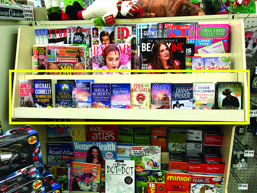
The periodical section of my local Rite Aid in Ridgewood, Queens. Out of the 11 novels they sell, 9 are romances.
That’s not to say there’s nothing to learn from the book as an object. Pick up any book you find at your local drugstore and the rough, cheap paper soaking up ink speaks clearly about the scale of production and the disposability of the books. Along with their pervasiveness, the scale of production hints at how big a business these are.
The romance genre is, according to the Romance Writers of America, a $1.08 billion a year industry and comprises 34% of the entire US fiction market. Given the money at stake, the value of making your cover look like other covers—signifying genre and category through how it looks—becomes indispensable. This extends to the covers themselves as seen in an interview with book designer Claire Brown in Print magazine: “The design of the romance genre is driven by sales, but the formula works. ‘There are constraints in how much we can deviate without alienating the reader,’ Brown says. ‘Familiarity in typeface and painterly style reassures the reader that this book is what you think it is going to be, and you are going to love it.'”
[Side note: if you want to tailspin into paranoid Pynchonian corporate conspiracy, follow the trail of parent companies for different romance publishers (or, really, any publisher). To wit: Mills & Boon (the largest British publisher of romances) is owned by Harlequin Books, which is owned by HarperCollins, which is owned by Newscorp (which also owns 20th Century Fox, Fox News, Dow Jones, and the Wall St Journal).]
The cultural position of these books, though, might be best described as ambivalent (celebrated or maligned, cast as feminist or anti-feminist based on who you ask) and we see these cultural expectations play out in the use of romance novels in different sitcoms.
Romance novels appearing in the following: Stranger Things, season two, episode nine (2017); Big Mouth, season one, episode five (2017); The Simpsons, season 15, episode 10 (2004); That ’70s Show, season six, episode 18 (2004).
Here, the cover is a signifier for the idea of a romance novel and is used as a prop to say something about the character or situation or to drive the plot.
In Stranger Things, a romance novel in the hands of one of the character’s mothers is used to signify her desire, redirected by her husband’s neglect and foreshadows the appearance of a handsome young stranger that shows up at her doorstep.
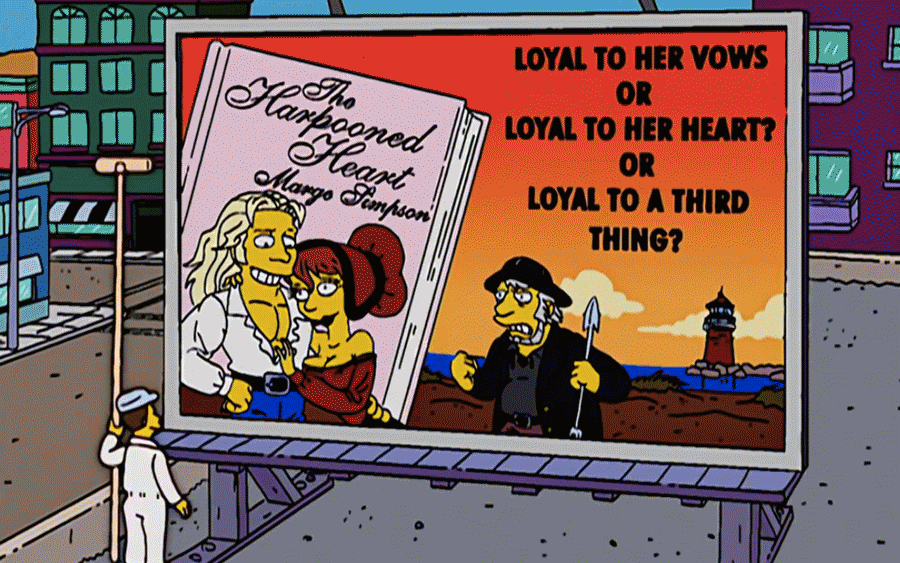
Second, we have an episode of the Simpsons where Marge decides to write a novel. The novel becomes an outlet for Marge to express her frustrations with Homer’s behavior and transforms Flanders into a Fabio-like object of desire. Homer is crushed by this once he finally gets around to listening to the audiobook.
Third, we have an episode of the show Big Mouth which deals with puberty and uses a romance novel to introduce the concept of women’s desire. Again, a character in the show is disappointed by her husband and redirects her desire toward a fantasy. Similarly, the husband is also devastated but attempts to embody her fantasy by dressing up in costume.
In these three examples, the romance novel symbolizes a woman’s desire that is threatening to the man’s position as patriarch. Desire begins to take on a subversive edge where it becomes a radical act which moves beyond a patriarchal relationship.
That ‘70s Show deviates from this a bit and takes an interesting approach where Red, the show’s hyper-masculine patriarch finds that his erotic imagination is expanded by reading a romance novel. However, he is also later emasculated when another character finds him reading one of Kitty’s “dirty girl books.” In a way, Red Forman seems to be punished by the show for “doing his gender wrong” and enjoying a romance novel which is coded as feminine. According to the philosopher Judith Butler, this behavior is punished because “it challenges, at least implicitly, the distinction between appearance and reality that structures a good deal of popular thinking about gender identity.”
In all of these cases, it’s worth noting that the cover doesn’t signify a specific text, but is meant to signify the category in which we can imagine the text belonging. For the fleeting moments the book is onscreen, we need to be able to recognize the book in the character’s hand as a romance novel; it doesn’t particularly matter which one.
But in the bookstore, it does matter. Though the category implies a set of formal conventions, these can engulf other genres and a range of identities and desires. This can be read typographically as well.
The strangeness and ambiguity begins to emerge in the part / whole relationship when trying to reconcile the category and the individual entries which build it.
Judith Butler explores gender this way by reaching back to the same Simone de Beauvoir quote that was defaced at the beginning of this (“One is not born but, rather, becomes a woman”) to decouple biological sex from cultural gender and build her idea of performative gender, in which, gender is something that you do. It is not an essential quality that drives behavior. Instead, she says, “gender is in no way a stable identity or locus of agency from which various acts proceed; rather it is an identity tenuously constituted in time—an identity instituted through a stylized repetition of acts.”
Similarly, we might extend this concept to gendered typography—there is nothing formal which is inherently masculine or feminine, only associations. And to map these, Wittgenstein’s concept of “family resemblances” proves useful.
A meaning built on family resemblances makes the proposition that the essence is not dug down into but, rather, is apparent on the surface through a process of ordering. It’s a networked rather than delineated form of meaning.
It presupposes that a category, such as romance, is not a clear, distinct thing. Rather, it’s formed through the interaction of what people apply the word “Romance” to. Jumping back to NPR’s crowd-sourcing, we can understand the nomination of a title as making the proposition “this is a member of the category Romance.” This proposition is fed through people’s overlapping understanding of what “Romance” means and the category is filled, and thus constituted, by the family resemblances of what it contains. The romance genre then becomes a landscape of overlapping fibers rather than one compressed, essentialized image with one defined meaning. Instead, Wittgenstein suggests, “we see a complicated network of similarities overlapping and criss-crossing: similarities in the large and in the small.”
The morphology serves as the application of this idea: collecting a set of covers together and setting them next to each other allows the viewer to see the fundamental ambiguity of how individual covers both speak for themselves and constitute an entry of a category and, thus, a gendered typography.