Type + Gender
This is our first digression.
It started with a phone call from Joe Voller at the NoVo Foundation, in the fall of 2016. He was looking for designers to create the identity for a new “Women’s Building” located in Chelsea on 20th Street, right off the Highline.
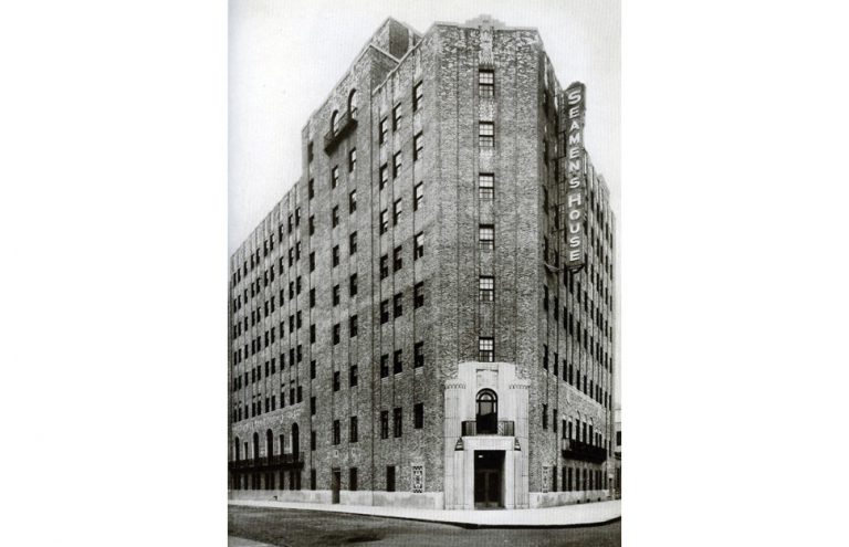
Built in 1931, it was original a YMCA and then became a state peniteniary in the 1970s. The site became the Bayview Women’s Correctional Facility for over 30 years before the all the prisoners were evacuated during hurricane sandy in 2012. The foundation was hoping to transform the vacant building from a symbol of incarceration into a hub of activism and social justice for women and girls and had already assembled a design team including architect Deborah Berke. It was an ambitious scope, to say the least.
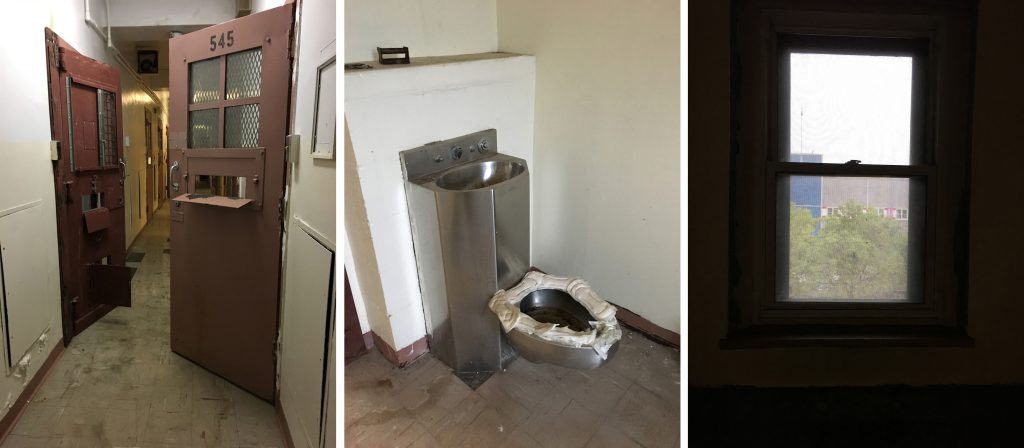
We visited the site which had since been abandoned after the evacuation. Inside there was obvious vestiges of the site’s seafaring past, especially in things like the chapel, but also grim artifacts of the lives of the inmates. And considering the building was located in Chelsea, the views out the window were particularly poignant.
The next ten months involved an intensive engagement phase. We met with a ton of focus groups and stakeholders, but this was not your typical branding audience findings process. We heard the stories of women who had been formerly incarcerated at bayview, folks who worked to end mass incarceration and fight for women’s rights in prison, native american women’s groups and gender equity rights groups…it was an amazing group of people who were incredibly diverse yet united with a common cause.
But we will not be showing the work we presented for the women’s building tonight. Instead we wanted to show where it took us.
Our research brought up questions of how you could ‘brand’ (lower case b) a group united by their inclusive spirit of resistance within a frame of activism. We asked ourselves:
And, within this immersive female environment,
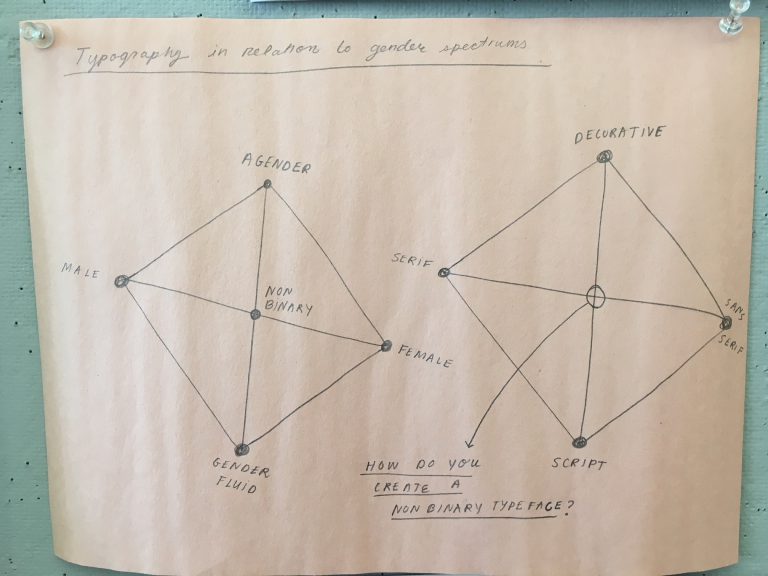
This is a sketch Olivia made when we were asking ourselves: are serifs female? sans serif male? is there such a thing as a gender fluid typeface? how could you reflect a gender spectrum through type?
We started sharing writings and links and took studio excursions to see some exhibitions… I think I speak for all of us when I say part of the gratification and challenge of this project was just making the time in the studio amidst client projects to engage in group research and swim in this self-assigned prompt.
We visited a show at the Met Breuer of Lygia Pape, a female Brazilian artist who was a critical figure in the development of Brazilian modern art and a member of the concrete movement with Hélio Otiticia. Pape wanted to integrate art with life experience using geometric abstraction and the physical body, time and space. She worked for two decades under a repressive military dictatorship which had resonance to what we are going through today.
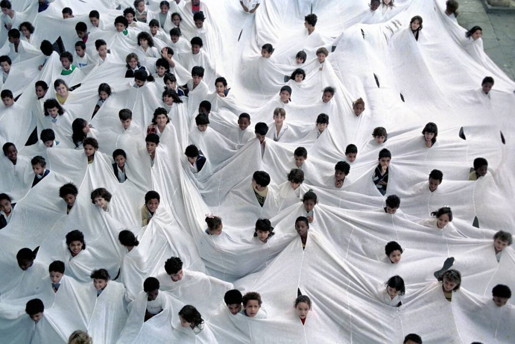
This piece is called Divisor from 1968 which she defined as a ‘social sculpture’ as a response to the ban on public protests. When we saw this it was an epiphany. THIS was the identity we wanted for the Women’s Building: individuals acting as one organism; aware of their individual impact but drawn by a collective current. Participatory. Social. It also reflected the call for a ‘new language’ for what the women’s building could be.
It was also very inspiring.
The following is a series of propositions inspired by this project, these events, and the questions that transpired. You will see:
Ian Keliher presenting an analysis of 100 romance covers and discussing the relationship of genre and gender
Sarah Gephart discussing a hypothetical hack to introduce a gender neutral pronoun glyph.
Federico Pérez Villoro sharing a discourse on language, color, and personal history through the colors blue and green
Sarah Mohammadi and Alicia Cheng conducting a group experiment where we see how a typeface can be a collective event.
Let the digressions begin…!